
Your bedroom is more than just a place to sleep—it is your personal sanctuary, a private retreat where you begin and end each day. The colours you choose for your bedroom walls play a profound role in shaping your mood, influencing your sleep quality, and defining your aesthetic style.
Finding the right color palette can feel overwhelming given the infinite choices available. However, understanding how different hues interact can help you craft a space that feels curated, harmonious, and uniquely yours. Whether you prefer tranquil, nature-inspired palettes or striking, dramatic accents, these thoughtfully selected bedroom wall colour combination ideas will inspire your next home makeover.
Table of Contents
1. Tranquil & Serene Palettes for Mindful Rest
If your primary goal is to create a peaceful environment that promotes deep relaxation and restful sleep, soft, cool tones are your best choice.
Soft Sage Green & Warm Cream
- The Vibe: Organic, soothing, and grounded.
- Why it Works: Sage green brings the calming elements of nature indoors without feeling overwhelming. When paired with a warm cream or off-white instead of a stark bright white, the contrast is gentle on the eyes.
- Styling Tip: Accentuate this pairing with light natural wood furniture, linen bedding, and indoor leafy plants to enhance the biophilic feel.
Dusty Blue & Muted Taupe
- The Vibe: Elegant, breezy, and timeless.
- Why it Works: Blue is scientifically proven to lower heart rates and promote calm. Pairing a muted, dusty blue with a warm, earthy taupe balances the cool undertones, keeping the bedroom cozy rather than chilly.
- Styling Tip: Add brushed brass or matte gold light fixtures to bring a touch of subtle luxury to this classic combination.
2. Rich & Dramatic Combinations for Moody Elegance
For those who view the bedroom as a cozy, cocoon-like haven, deep, saturated colors create an atmosphere of sophisticated intimacy.
Navy Blue & Earthy Terracotta
- The Vibe: Bold, warm, and sophisticated.
- Why it Works: Deep navy provides a strong, grounding backdrop, while warm terracotta adds energetic contrast without being overly bright. The opposition of cool blue and warm earth tones creates dynamic visual interest.
- Styling Tip: Use navy on a feature accent wall behind the bed, with warm terracotta accent pillows, rugs, or artwork across the room.
Charcoal Grey & Soft Blush Pink
- The Vibe: Modern, balanced, and chic.
- Why it Works: Charcoal grey offers dramatic depth, but on its own, it can feel cold or industrial. Soft blush pink injects delicate warmth and softness, striking a perfect balance between masculine and feminine energy.
- Styling Tip: Incorporate plush velvet textures in the bedding or upholstery to highlight the richness of the dark grey.
3. Warm & Cozy Neutrals for Timeless Comfort
Neutrals never go out of style, but modern design moves far beyond basic beige. Today’s neutral palettes rely on subtle tonal variations to build depth.
| Primary Wall Tone | Secondary / Accent Wall | Ideal Furniture Finish | Overall Aesthetic |
| Warm Greige | Crisp Alabaster | Light Oak / Natural Cane | Scandi Minimalist |
| Oatmeal / Warm Ivory | Deep Olive Green | Walnut / Dark Wood | Earthy Contemporary |
| Muted Terracotta | Soft Sand | Whitewashed Wood | Mediterranean / Boho |
Greige & Crisp Alabaster
- The Vibe: Minimalist, airy, and refined.
- Why it Works: “Greige”—a hybrid of grey and beige—gives you the modern crispness of grey with the inviting warmth of beige. Paired with alabaster white architectural trim or an accent wall, it reflects light beautifully.
- Styling Tip: Layer abundant textures—knitted throw blankets, bouclé chairs, and woven jute rugs—to prevent neutral colors from feeling flat.
4. Modern & Vibrant Ideas for Expressive Spaces
If you want your bedroom to reflect creativity, energy, and warmth, don’t shy away from vibrant hues—just balance them carefully.
Ochre Yellow & Warm Charcoal
- The Vibe: Energetic yet grounded, vintage-modern.
- Why it Works: Mustard or ochre yellow brings sunshine and optimism into a room. Charcoal acts as a heavy anchor, preventing the yellow from feeling too intense or childish.
- Styling Tip: Paint three walls in a soft neutral tone and use ochre yellow on an architectural feature, such as a bed recess, arched wall section, or structural chimney breast.
How to Choose the Right Wall Colour Combination?
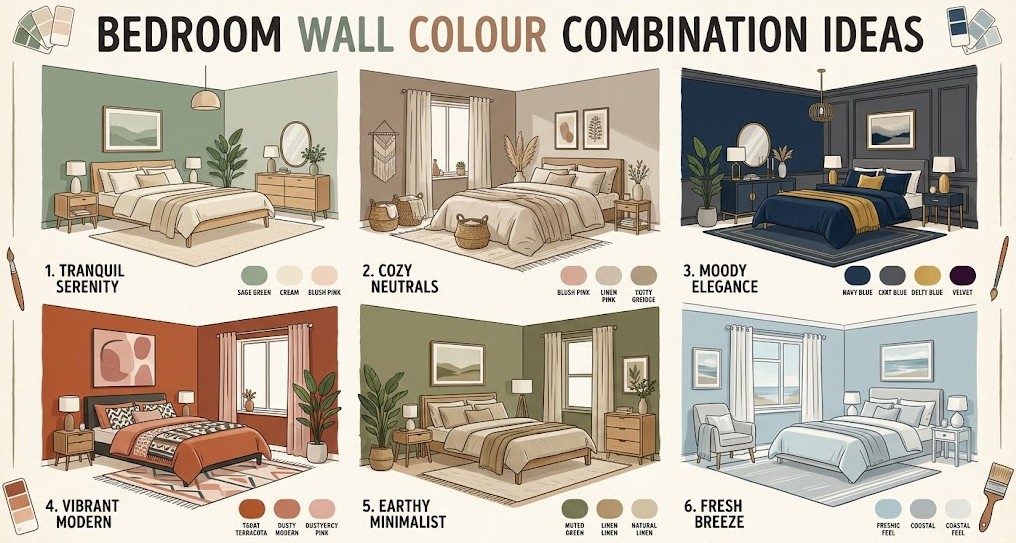
When selecting from these bedroom wall colour combination ideas, keep these practical design principles in mind:
The 60-30-10 Rule: For a balanced room, dedicate 60% of the space to your dominant wall colour, 30% to your secondary colour (furniture, curtains, or accent wall), and 10% to an accent colour (pillows, artwork, and decor accessories).
- Assess Your Natural Light:
- North-facing rooms receive cool, bluish light; warm-toned wall colours (terracotta, beige, warm blush) offset this chill.
- South-facing rooms receive intense, warm sunlight; cool-toned wall colours (sage, navy, soft grey) balance the warmth.
- Test Before You Paint: Always paint large sample swatches on your walls and observe them at different times of day—under morning sunlight, afternoon glare, and warm artificial bulb lighting at night.
- Consider the Ceiling: Don’t forget your “fifth wall.” Painting the ceiling a soft shade of your accent colour can lower a high ceiling for extra coziness, while a bright off-white ceiling makes low ceilings feel higher.
Final Thoughts
Your bedroom walls set the emotional tone for your daily routine. Whether you lean toward the quiet solace of sage green, the moody depth of navy and terracotta, or the clean warmth of greige, the right color combination turns four plain walls into a personal sanctuary. Take your time with swatches, trust your personal taste, and create a space where you truly love to unwind.